Work / Superpedestrian Link
Micromobility service design
I led the design of brand identity, consumer mobile app, SaaS operations web app, and vehicle design of the world’s safest scooter sharing service that grossed $40MM annually across 8 countries, 50 cities 25MM trips, and 1MM annual riders. The product of my work propelled the company to scale for 4 years. I changed the culture of collaboration whereas design was the coordinator rather than stylist executor. We made the Late Show with Stephen Colbert and were named top 10 most innovative companies by FastCo.
2018
Role: Design Lead
Team: Industrial designer, Visual designer, UI designer
Brand identity • Mobile app • Web app B2B • Embedded interface • Vehicle design
LINK brand identity guidelines. Done in collaboration with Piet Aukeman.
Designing the future of micromobility
Strategic framework
In 2018 the scooter share flavor of micromobility was exploding. Cities all over the globe were seeing tens of thousands of cheap scooters deployed on their streets with soaring rider demand. Scooter share operators were just software companies with gig economy, contractors to move their scooters around the city so the overall IQ was low. The scooters deployed on the street, where consumer grade toys with rudimentary IoT, which in the shared fleet context, had a lifespan of less than 22 days. City governments having been burned by the ride sharing boom of the past, were ready for a regulatory fight with operators by using the leverage of permit granting to demand safety and equity of access. There was nobody solving these next order problems and the industry was ripe for new solutions.
Superpedestrian had deep expertise in drive systems, embedded electronics, and industrial design. The design of the best scooters at the time were incredibly ill-suited for reality. They were meant for smooth concrete slabs and sidewalks not the street infrastructure of American cities. With the unique advantage to be vertically integrated in hardware, software, and user experience, we set out to create the safest and most enjoyable scooter sharing platform in the world.
Approach
Build the scooter
Try to sell it
Become a vertically integrated operator to prove it works
Create a consumer micromobility experience
Design principles
Safe
Fast time to market
Cheap
Durable
Reliable
Repairable
Future-proof
Easy, right?
Making safety sell
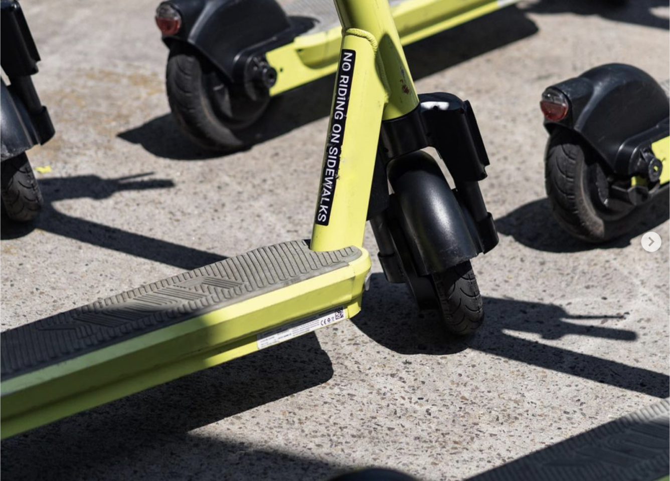
Calling on my network of collaborators, I worked with a visual designer to define the brand identity. Referencing the world’s best known transit systems, utilities, and public sector identities we crafted a unique identity to match the advanced and reliable quality of the service. Colors were chosen to reflect the best in class safety, while fusing with elements of street style. Because after all the scooters have to make riders look good too. Primary among identity requirements was extreme visibility both for rider safety and for vehicle visibility on street corners. The scooters had to be visible from blocks away.
Making frictionless booking
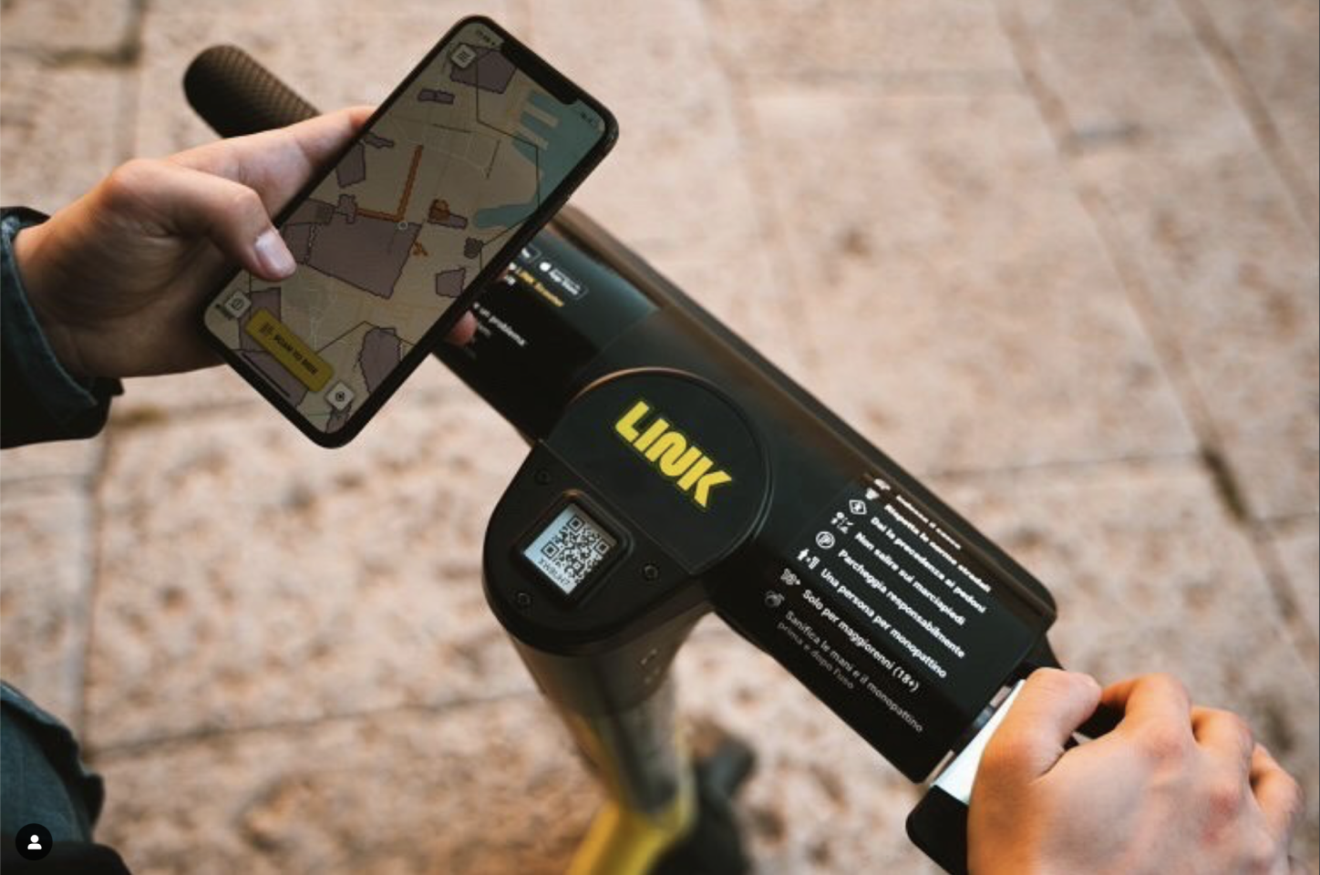
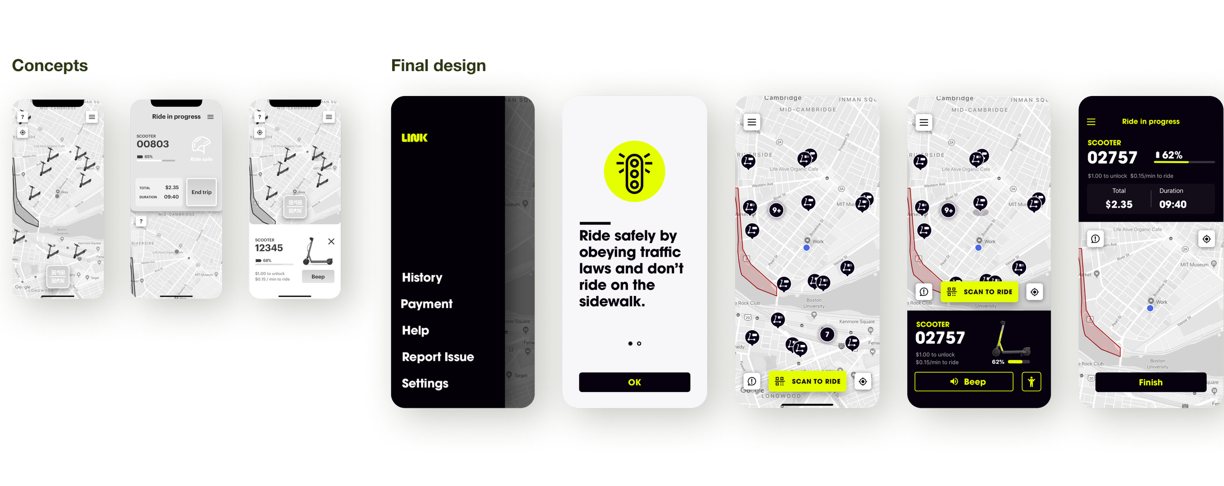
The design of the LINK mobile app was an exercise in extreme accessibility and frictionless UX. The experience of finding booking and riding a scooter has to be instantaneous or else other options displace it. Working in parallel with the embedded electronics and mechanical engineering teams, we created a set of interfaces on the vehicle and in the mobile app that worked seamlessly together. It was my pleasure to create this new language of screen-less interaction design and it has increased my appetite to cross disciplinary boundaries.
Making Vehicle Intelligence happen for SaaS operators
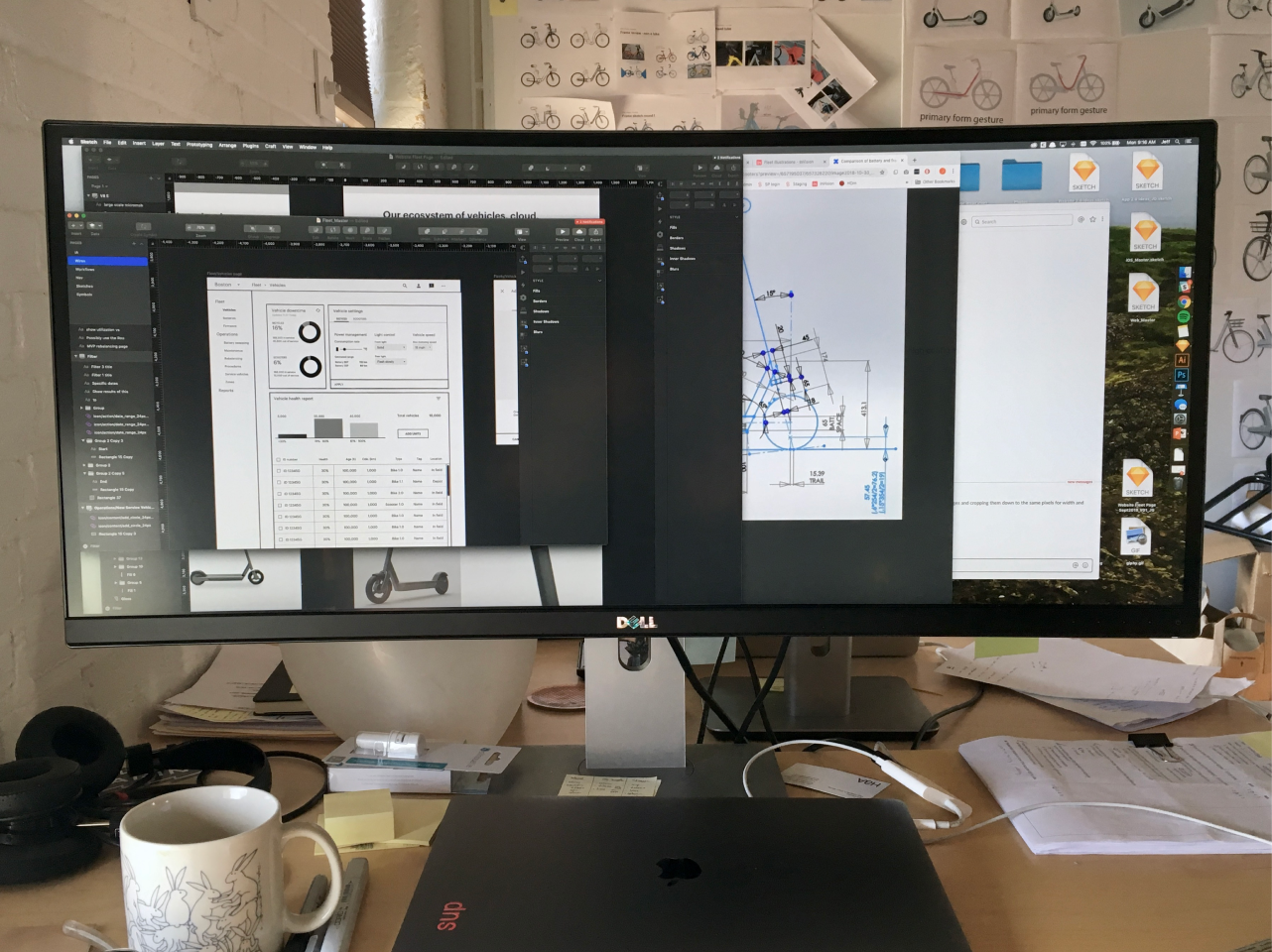
One of the key differentiators of our ecosystem is that we could have precise knowledge of the health of each electromechanical component on our vehicles. This meant that for the first time in the industry a dashboard could be created to understand the health of a fleet and thereby create hyper-efficient service routes. I was the lead for the UX, UI, and architecture of this new responsive web app. It was the original intent to make this software scalable, vehicle-agnostic, and a standalone revenue stream. With one interaction designer (me) that was a massive undertaking.
My approach was to use themed Material Design as it would allow us to use an out of the box theme-able design system and front end libraries to scale the limited design and development resources we had. This pragmatic and effective approach allowed us to iterate with lightning speed and instantly respond to feedback from the market and conquer ambiguity.
Setting the new standard in ride experience
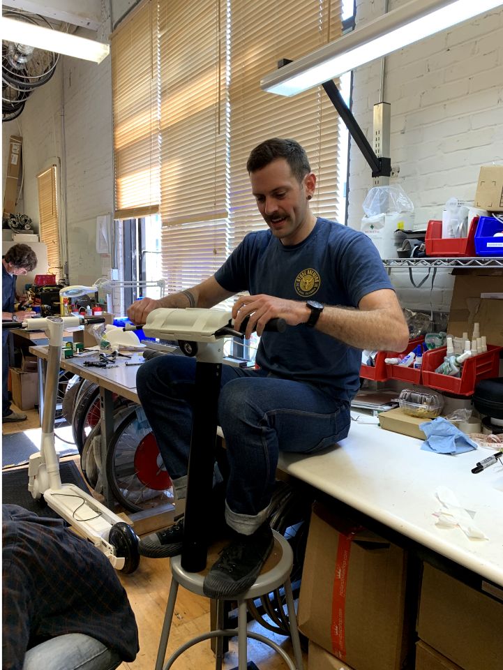
While I went to school for industrial design, I’m not a modeling ninja, but I have a practiced method of continual iteration and lateral thinking that prepared me to lead the design of the vehicle itself. The designer who reported to me was a great partner as I pushed for a hyper collaborative process with multiple engineering disciplines. In many cases design acted as the coordinator of the overall project because we were intimately involved in all parts of development. This was a great education for me in the value of relationships to galvanize a collaborative spirit.
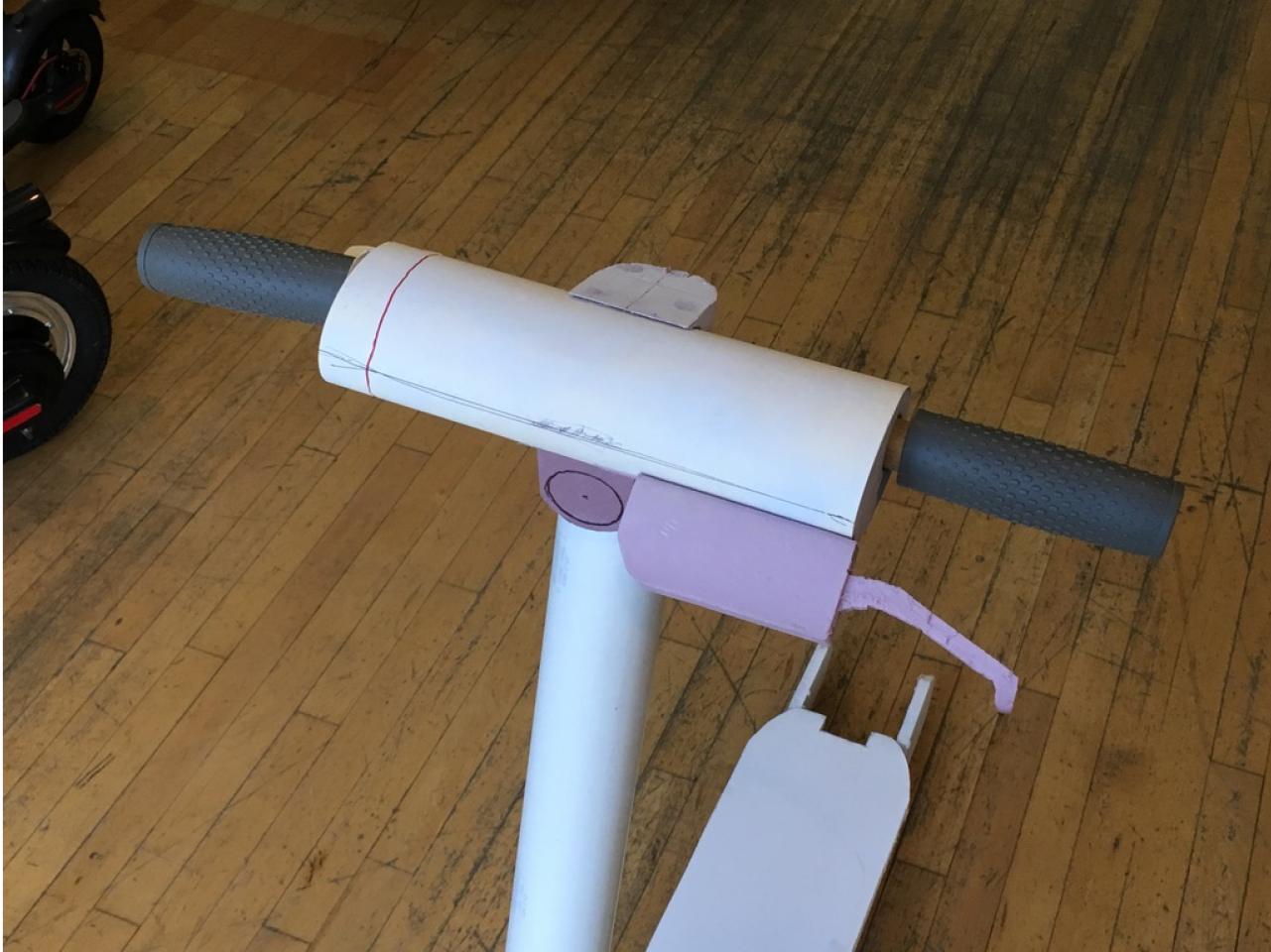
The strategy we took when designing our own scooter from the ground up was to balance rider experience with reliability and logistics considerations. I led the design of a new economic approach to scooter geometry. This made our scooters effortless to ride for people of all sizes and safer while traveling over maintained City roads. another consideration to increase reliability of scooters was to protect from rampant abuse and vandalism, which led to several engineering and design innovations for cable management, chassis, design, and cockpit design. The result is a scooter that lasts three years and counting as opposed to 25 days. Another unique challenge in designing the vehicle was a bombproof and an expensive interface. The solution we arrived at was an array of LED circumscribed over the throttle, able to communicate basic states to potential riders as well as operations staff. The hardware platform we designed was envisioned to accept future modifications such as seats and baskets to make it more accessible and useful.


